Awake
A new gallery concept has opened in Mt. Pleasant, SC. Affordable Art of Charleston focuses on affordable, contemporary art by local artists. Their next show, opening March 12 and running through April 30, is called Awake, a group show highlighting emerging Charleston artists.
“I want to awake art patrons to the many great emerging artists in the Charleston area,” describes gallery owner Carol Williams. Awake features four artists that we think you should know.
![]()
TAYLOR FAULKNER
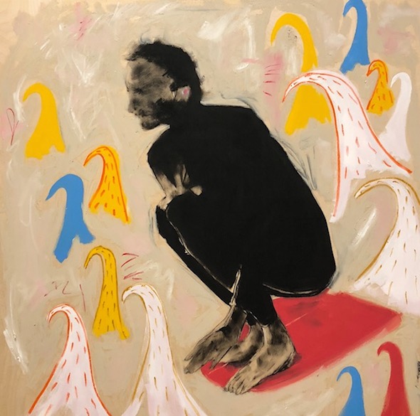
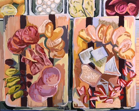
Taylor Faulkner, The Wave Looks Good
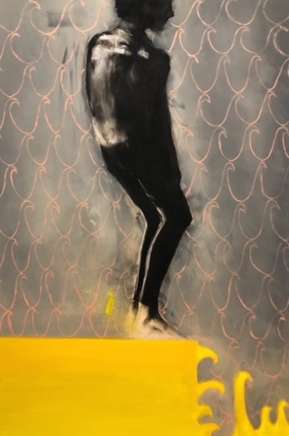
Taylor Faulkner, Big Glide
Taylor Faulkner loves the ocean, movement, and surfing. “So that tends to be a major subject in the pieces I create,” she explains. “I tend to make art about what I’m passionate about.”
Her connection to surfing has influenced her art. “The surf scene isn’t large in Charleston, but the people that choose to live and surf here are so passionate about what they do.”
Falkner usually starts her pieces with muted tones then layers in random pops of color and pattern, creating a sense of fun with a dash of depth. “I love oils and pastels because I love the way I can push the material all over the place. It’s super satisfying,” she says.
“Art is everything, and it means everything. I love that people create, and come together to share this raw act,” she says. “I make because I have to. Creating something from nothing is the greatest feeling in the world. I love to keep pushing myself to try new materials, and my art has evolved because of that.”
![]()
KATE COMEN
Kate Comen, Deli Lunch In Charleston, 24 x 30
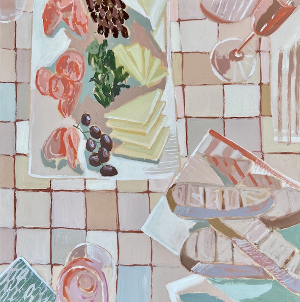
Kate Coman
Everyone can relate to food, which is why it’s the subject matter Kate Comen is primarily inspired to paint. “I use imagery from photographs that I have taken, or family and friends have taken, so the paintings are personal to me but can relate to the viewer because of the universal nature of food,” she says.
Comen creates with acrylic and gouache on wood panels. “I usually don’t plan out paintings,” she comments. Instead, she starts with the basic shapes of the objects and goes from there, with “each previous color helping to inform what color comes next,” she describes. “I strive to create a harmony between color, line, and texture so that the painting brings warmth to the space it gets placed in. “
Growing up in Charleston and following the careers of many different artists inspired Comen to start painting. “Charleston also provides a lot of inspiration from the colors and textures found throughout the city,” she says.
![]()
PAGE FEIGLY SMYTHE
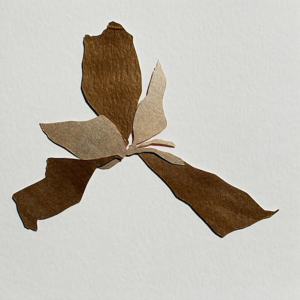
Paige Feigly Smythe, Papercut Flower
Paige Feigly Smythe loves the endless details found in nature. “I’m fascinated by the colors, patterns, and textures of each season,” she shares. “My art is a way of processing the world around me. Creating work based on the excitement and fascination I get when looking at nature brings me so much joy and energy—I can’t help but recreate something with my hands.”
She’s also inspired by the creativity of local florists. “I love seeing what flowers and plants they use to pull together an arrangement.”
Smythe uses collage to focus on the details and layers she finds in nature. “My hope for my floral bouquet artwork is that it will represent the emotions evoked by those who give and receive bouquets,” she explains. “Often this type of gift stems from extreme emotions—heavy ones such as illness, death, heartbreak or positive ones such as gratitude, encouragement, and love.”
She didn’t intend to start working with paper. Smythe originally envisioned wooden cutout pieces and used paper to create the stencils. “I got hooked after arranging different [paper] cutouts to form floral bouquets and haven’t moved back to working with wood since,” she describes. She’ll often not sketch anything out and just start cutting with scissors. “I love the freedom this allows and organic floral shapes that emerge from not having something drawn to cut from.”
![]()
KRISTY BISHOP
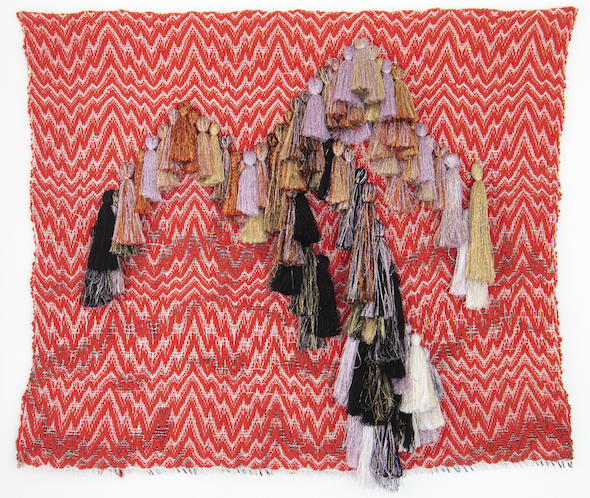
Kristy Bishop
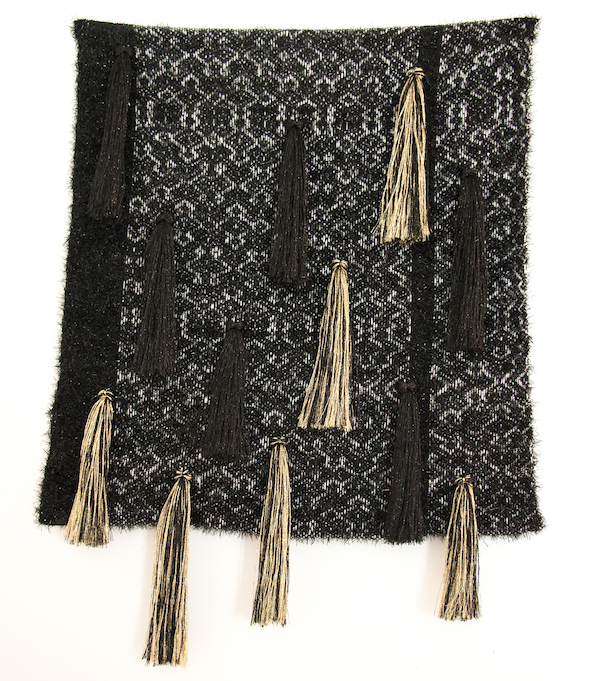
Kristy Bishop
Kristy Bishop weaves unapologetically feminine tapestries. Her color choices are often pinks and reds, “derivative of the flesh,” she explains. You can spot her fabric art by her use of bold weaving patterns with large tassels and fringe, which Bishop compares to that of a Burlesque dancer. “The performer uses tassels as a satire on modesty, covering the nipple yet drawing even more attention to it,” she says.
Different from other mediums, fiber artists aren’t expected to create something that represents something in real life. “The material itself automatically pushed me to be more abstract in general, and I’m not worried about it looking like something or telling a story necessarily,” says Bishop. “It can represent a feeling or, for me, the process is important. The making of it is the most important part, and that’s why I love it. I like making stuff that doesn’t have to look like things that exist.”
![]()
Stay Connected t0 the Arts:
![]()


Comments (0)
No comments yet
The comments are closed.